Redesign Project
Timeline:
Aug 2024 - Oct 2024
Role:
Entire redesign, from analysis to testing, and ideating to retesting.
Tools:
Figma and Miro
Introduction
Understanding What and Who
What is RMIT Career Centre?
RMIT Career Centre is an online hub that provides resources and connects users to personalised support from the JobShop, a RMIT service specialising in career advice and help.
Book appointments for consultations and events, tailored to your circumstances.
Find jobs and internship listings.
Use resources to prepare and level up in your career.
View courses that increase one's employability.
Who is using RMIT Career Centre?
As RMIT Career Centre supports students and graduates (12 months post-completion) of RMIT university, who are just starting out in their careers, I have decided to narrow the user attributes to:

Age: 17 - 30
Goals:
Make event and appointment bookings efficiently
Find booking information quickly
Find career resources such as industry reports and tips easily
Influencers:
Simple, straightforward and easy to use
Clean interface
Time-efficient
Problem 01
Wayfinding

If the gif above does not work, view the video version here
The original interface does not indicate what category is currently active and where the current page belongs to within the website.
This makes it hard to find a specific page quickly, identify what page I am on and how I reached it.
Related Usability Principles:
‘You are here’ - Steve Krug
Visibility of System Status - Jakob Nielsen
Recognition Rather than Recall - Jakob Nielsen
Measuring the Problem Severity
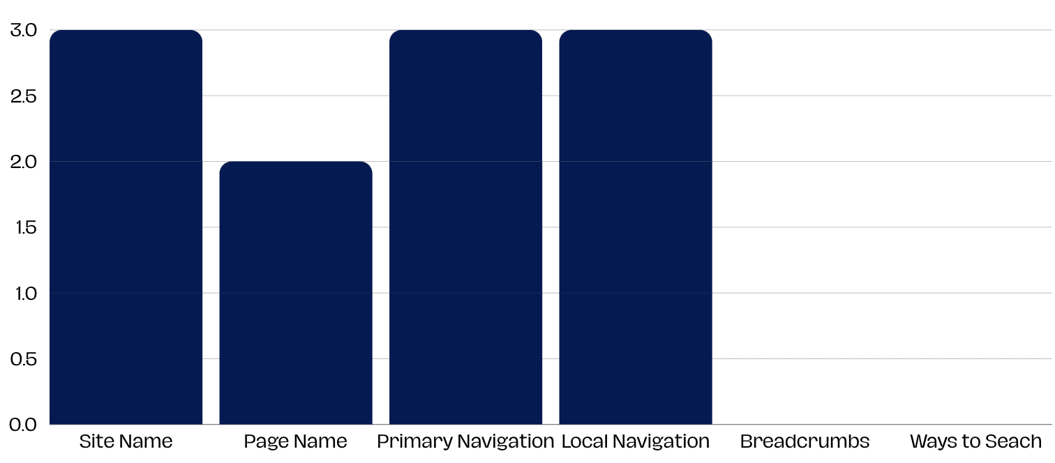
Not all participants could easily identify the Page Name, Ways to Search and Breadcrumbs using the trunk test in the original interface. This means these three elements which help with website navigation are not obvious or do not exist in the interface.
Reaching a Solution
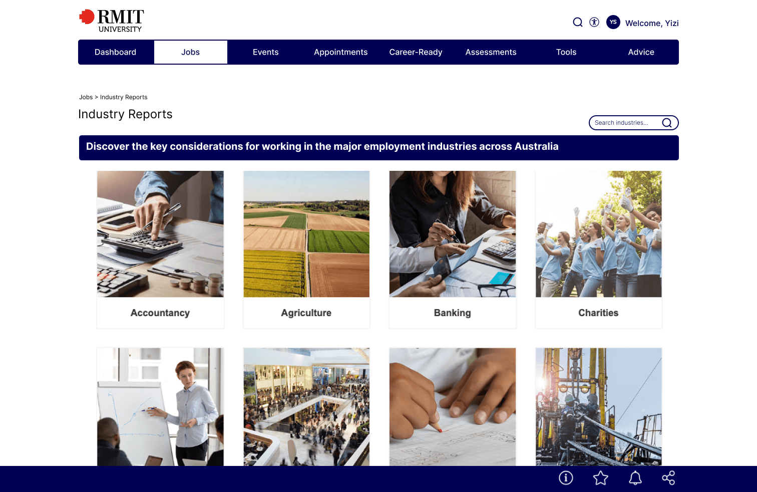
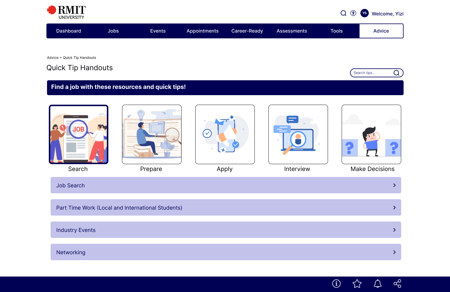
In my redesign, I moved the search bar to the top of the page. I removed the background image behind the page name and added breadcrumbs to show the user's current location and how they reached there. The global navigation bar now shows which category the current page is under.
Validating the Solution
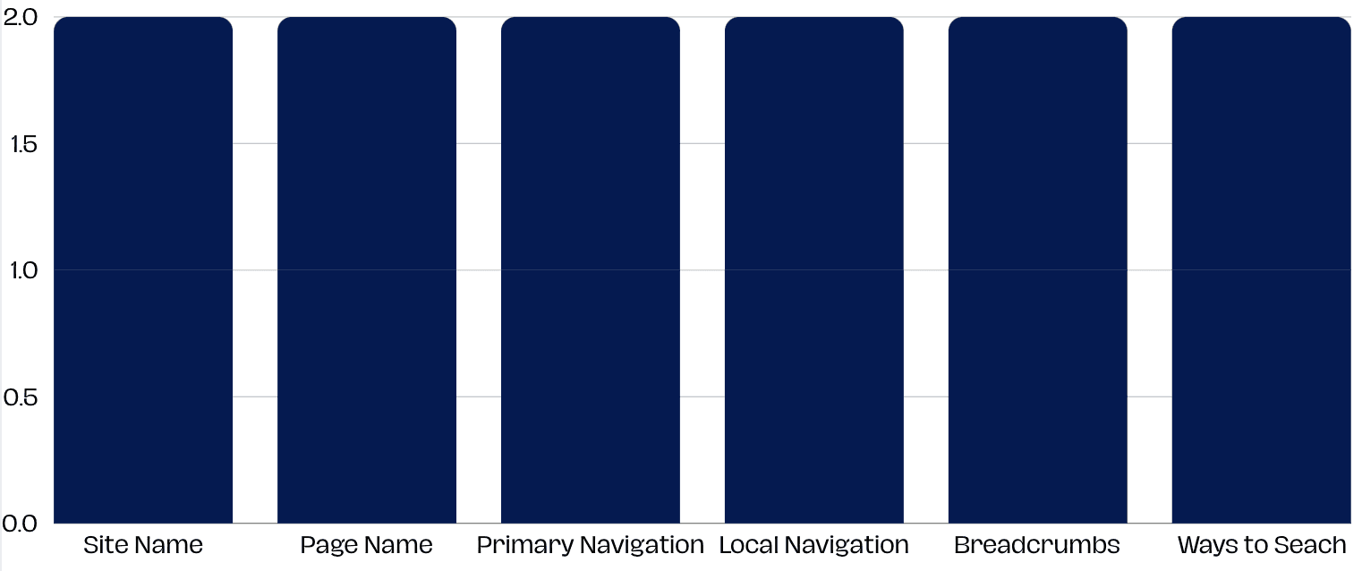
All participants could identify all parts of the interface successfully in the redesign.
Original and Redesign Comparison
Before
After
Problem 02
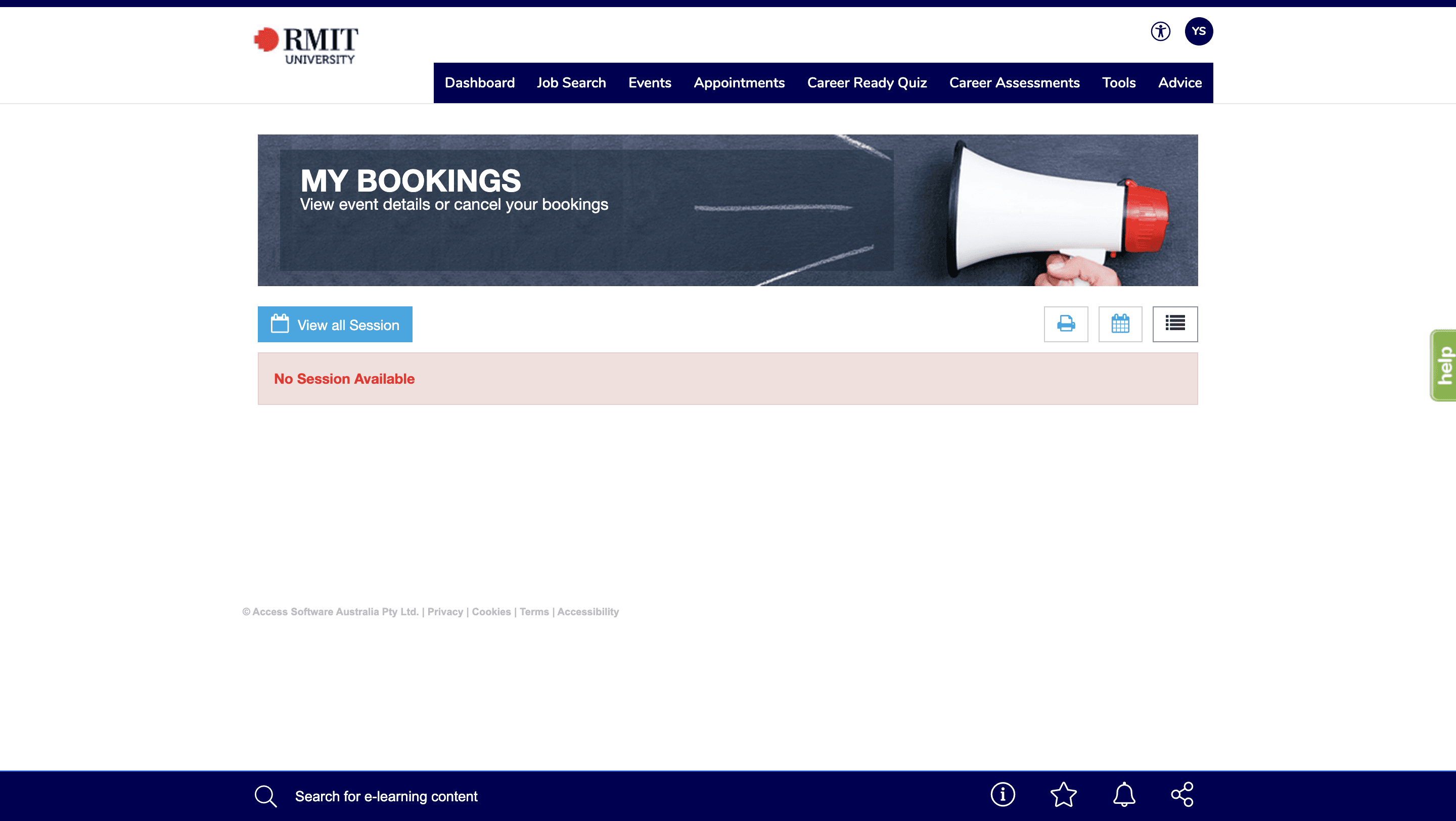
Navigating to My Bookings

If the gif above does not work, view the video version here
All the bookings the user has made are inside 'My Bookings', which is placed inside Appointments and Events categories. It takes 2 to 3 clicks to reach, which can lead to them muddling through to find.
As a new user, it was difficult to find as I would expect all bookings to appear on Dashboard or Profile. As an old user, it became time-consuming to take multiple clicks, especially as the website loads slowly.
Related Usability Principles:
Less is more - Steve Krug
Scanning, satisficing and muddling through - Steve Krug
Flexibility and Efficiency of Use - Jakob Nielsen
Match Between the System and the Real World - Jakob Nielsen
Measuring the Problem Severity
Success Rate: 33.33%
Average Time on Task: 118 Seconds
Using a moderated usability test, participants found it difficult to create a booking for the information session about RMIT Industry Experience Program.
Reaching a Solution
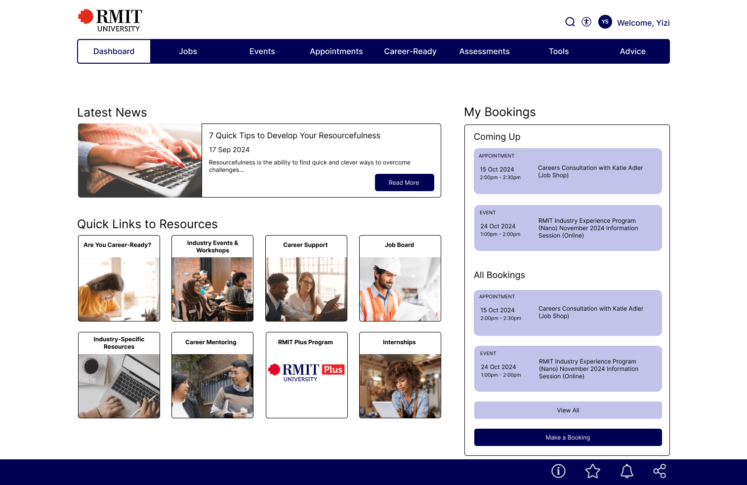
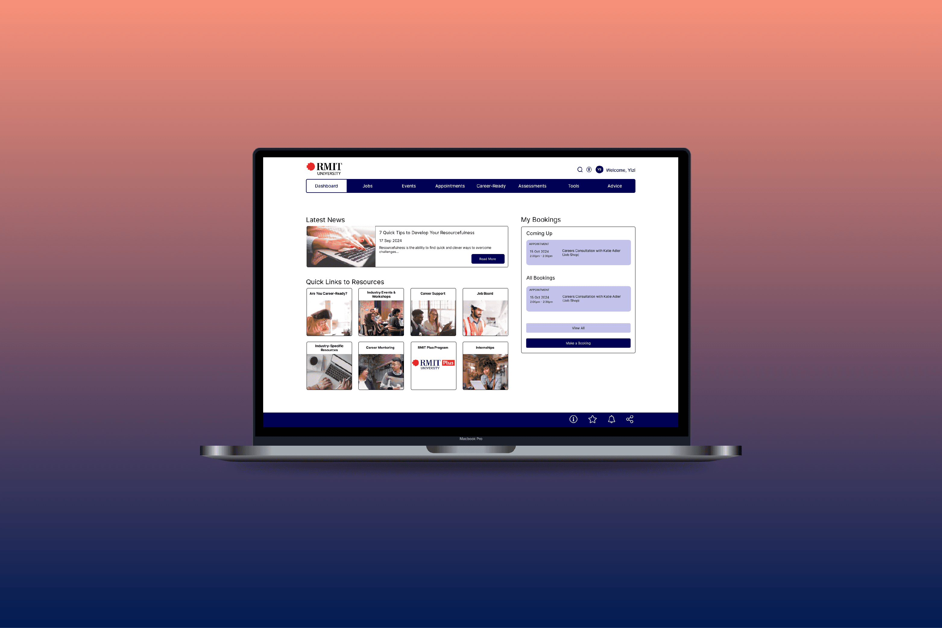
In my redesign, I moved ‘My Bookings’ to Dashboard, which is the first page the user sees when they log into the website. They can find their upcoming bookings at one glance.
Validating the Solution
Success Rate: 100%
Average Time on Task: 58 Seconds
The redesign was an improvement of the original design, where participants found it easier to complete the task.
Original and Redesign Comparison
Before
After
Success Rate: 33.33%
Average Time on Task: 118 Seconds
Original
Success Rate: 100%
Average Time on Task: 58 Seconds
Redesign
Problem 03
Visual Hierarchy and Layout

If the gif above does not work, view the video version here
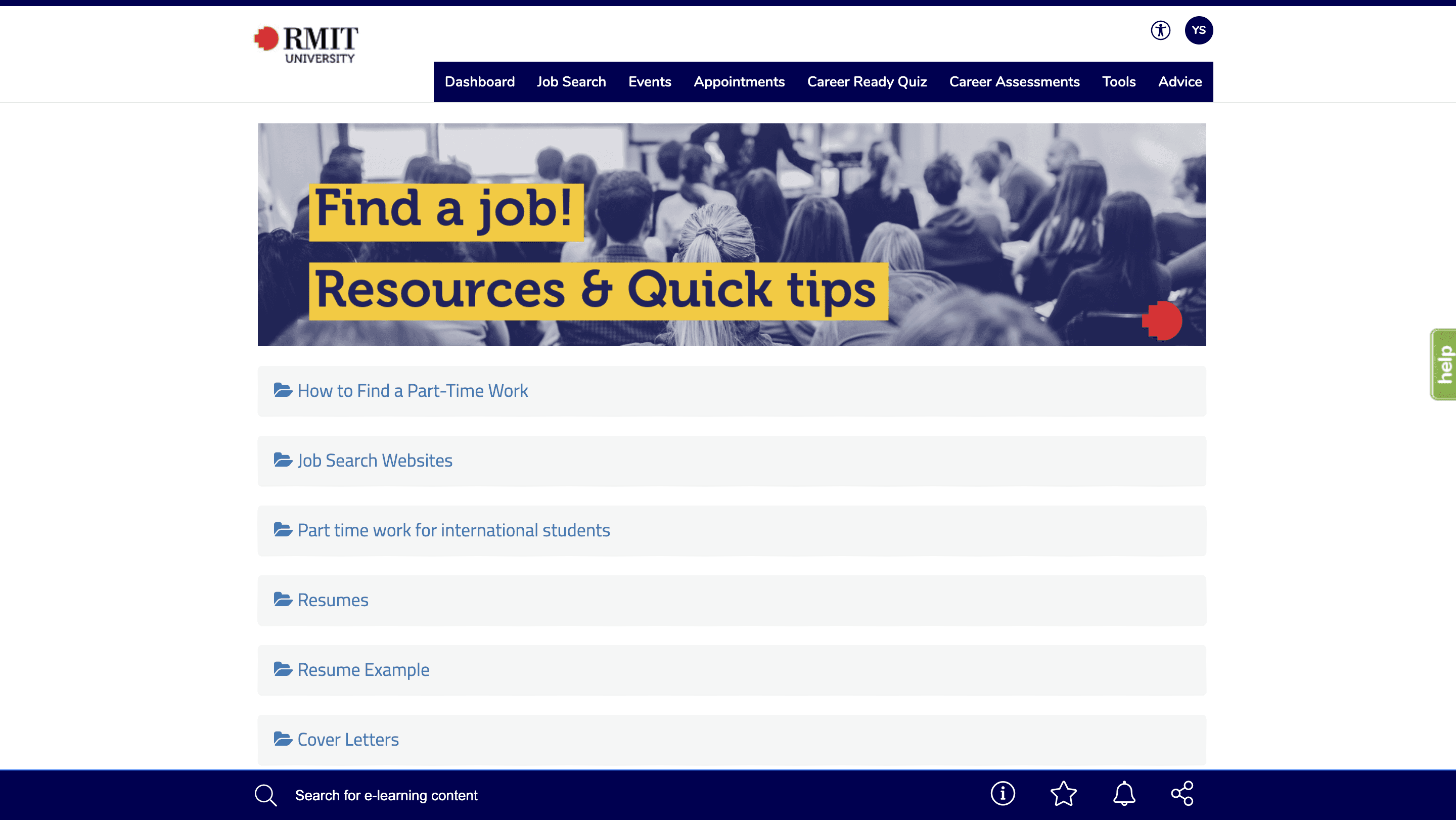
Many of RMIT Career Centre’s pages are filled with text and often lack distinct hierarchy or contrast. This causes excessive scroll and being unable to find things quickly.
I have to slowly read through all the information, which becomes a boring experience.
Related Usability Principles:
Simplicity, clarity and visual hierarchy - Steve Krug
Users scan, don’t read - Steve Krug
Simplicity, clarity and visual hierarchy - Steve Krug
Aesthetic and Minimalist Design - Jakob Nielsen
Measuring the Problem Severity
Average Recall: 3 Items
In a 5-second test, participants recalled 3 items in the original.
Reaching a Solution
In my redesign, I categorised similar topics together to reduce the visual clutter. Graphics were added to visually aid the different categories, making it easier for users to process.
Validating the Solution
Average Recall: 4 Items
The redesign saw an improvement of participants recalling 4 items.
Original and Redesign Comparison
Average Recall: 3 Items
Original
Average Recall: 4 Items
Redesign
Problem 04
Error Prevention
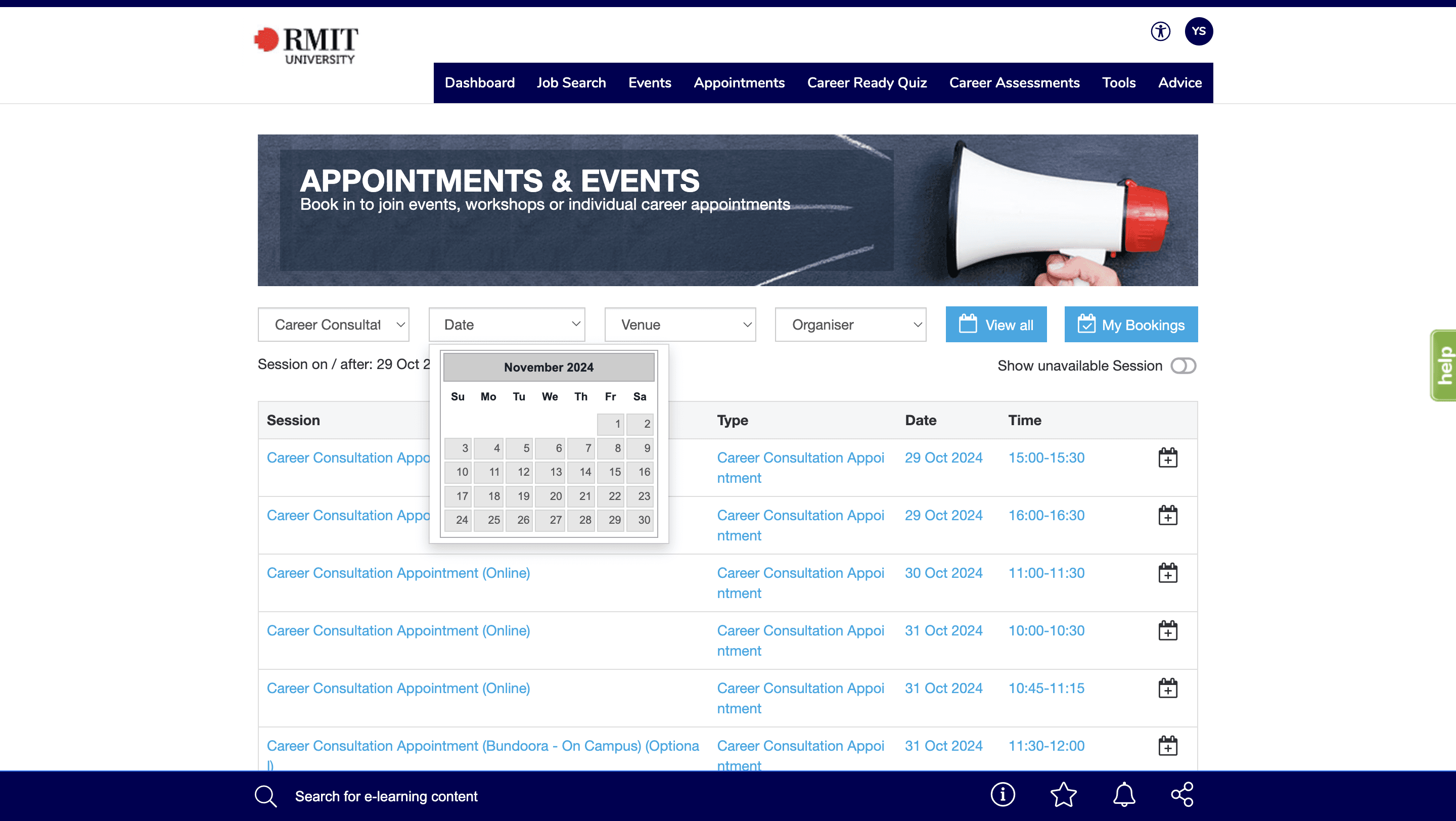
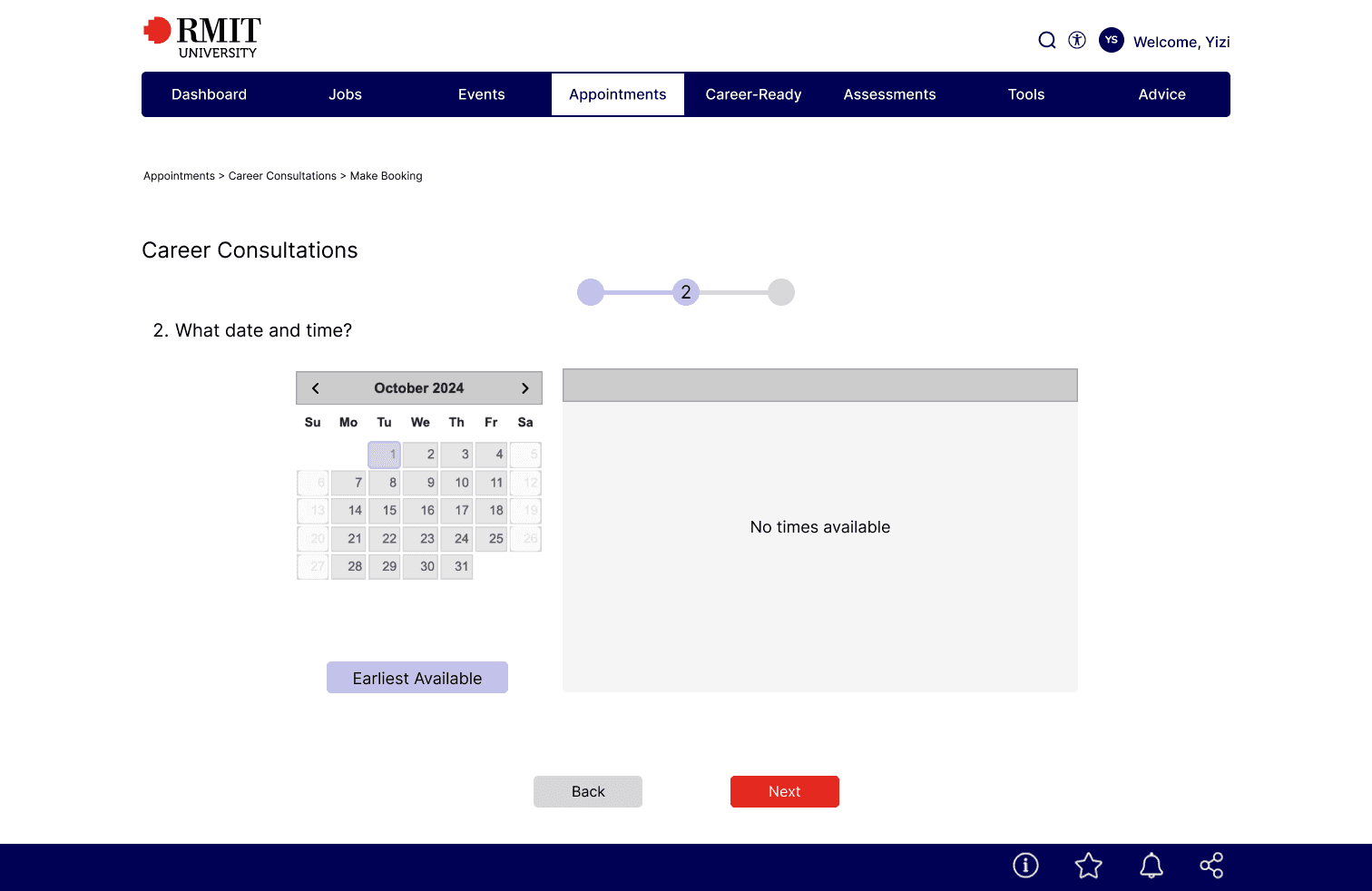
RMIT Career Centre’s calendar interface in the Appointments and Events pages are missing arrow buttons. Furthermore, the weekend dates are clickable, despite no appointments and events taking place in the JobShop on weekends.
As a new user booking appointments, I was perplexed as to why there were no results when I was unknowingly clicking on weekend dates.
Related Usability Principles:
Help Users Recognise, Diagnose and Recover from Errors - Jakob Nielsen
Error Prevention - Jakob Nielsen
We Make Errors - Jeff Johnson
